The Typographic Universe
Take a closer look at The Typographic Universe
Getting an overview of and insight into available typefaces can be a challenge for graphic designers. This infographic, which is printed on A0 format paper, will help with that. The Typographic Universe shows the history, classification, and main characteristics of 150 typefaces as well as the relationships between them.
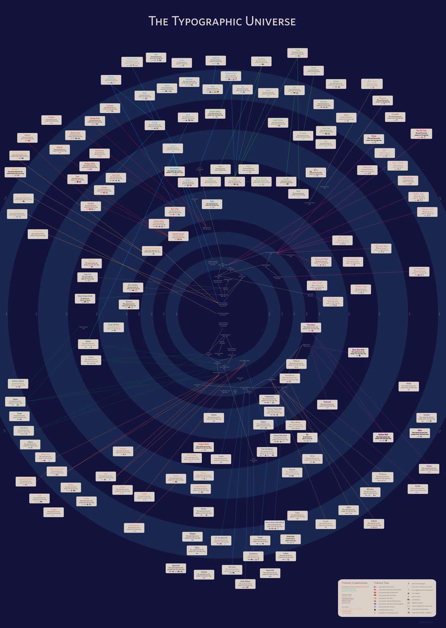
The timeline of The Typographic Universe runs from the 5th century BC, in the centre of the infographic, to the year 2000 and beyond, in the outer circle. The inner rings each span a period of a hundred years, the wider outer rings only twenty years. The typefaces are situated in time based on their year of completion. Bembo, for example, was completed in the year 1929, so it is placed in the 1920-to-1940 ring (see above).
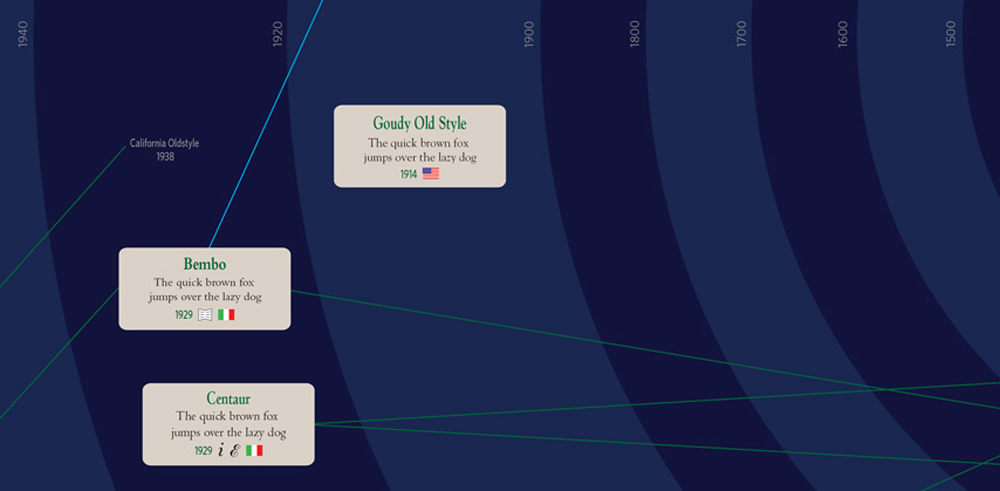
At the centre the milestones in the early history of typography are shown, going from ancient Greek inscriptions to the work of Giambatista Bodoni and Firmin Didot in the 19th century, among others. The relationships between those milestones are indicated by straight lines. In the figure above, for example, we see that the work of Nicolas Jenson (around 1470) was inspired by Roman inscriptional capitals (1st century AD) and the Carolingian minuscule (800 to 1200).
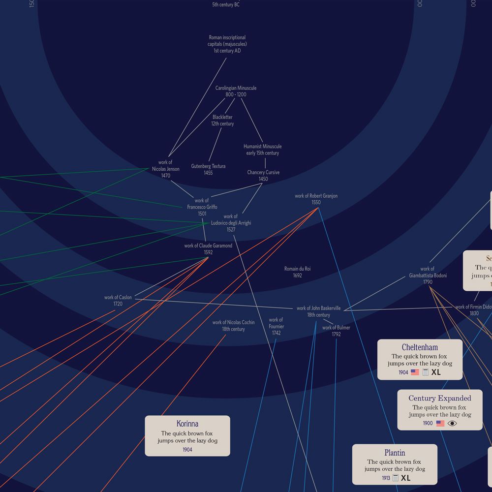
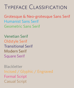
On the labels the name of the typeface is mentioned, followed by the sample text “The quick brown fox jumps over the lazy dog”, both set in the typeface itself. Next appear the year of completion and the tags associated with the typeface, which I will return to later. The text colour of the name of the typeface and of the year of completion indicates the class to which the typeface belongs, as does the colour of the lines representing the relationships between the typefaces. In the example above, Radio, Home Run Script, Zapfino, Medici Script, Young Baroque, and Poetica Chancery are all formal scripts, belonging to the same type class. The Typographic Universe uses this common typeface classification system:
The main characteristics of the typefaces are identified by the following tags:
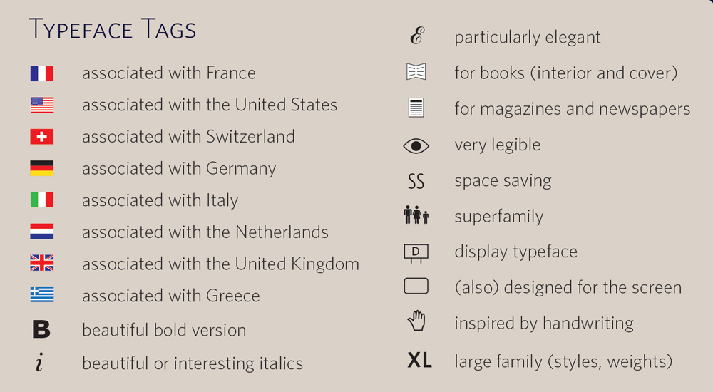
These tags make it possible to easily locate typically French typefaces, to give but one example, or typefaces specifically designed for the screen, to give another.
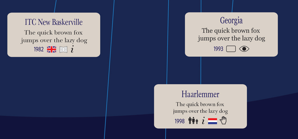
The figure above shows that ITC New Baskerville is a quintessentially British typeface, popular in book design (for covers as well as the interior of books), with beautiful italics. Haarlemmer, on the other hand, belongs to a superfamily (with Haarlemmer Sans), also has beautiful italics, is a typically Dutch typeface, and is strongly influenced by handwriting (in particular the chancery hand).
The Typographic Universe features 150 typefaces, selected on the basis of their prominence, quality, and originality:
Aachen, Akkurat, Akzidenz Grotesk, Albertus, Ambroise, Amplitude, Antique Olive, Archer, Arnhem, Avant Garde, Avenir, Balance, Bank Gothic, Bank Script, ITC New Baskerville, Bauer Bodoni, Bell Centennial, Bembo, Benton Sans, Berkeley Oldstyle, Bernhard Tango, Beton, Bickham Script, ITC Bodoni, Bree, Broadway, Adobe Bulmer, Bureau Grot, Caecilia, Adobe Caslon, Centaur, Century Expanded, Century Schoolbook, New Century Schoolbook, Cheltenham, Clarendon, Clifford, Cochin, Commercial Script, Cooper Black, Copperplate Gothic, Corvinus Skyline, Cronos, Dax, HTF Didot, Din 1451, FF Din, Diotima, Dorchester Script, Eckmann, Edwardian Script, Ellington, Eras, Eurostile, Farao, Farnham, Fedra Serif, Fenice, Filosofia, Folio, Fontella, Fournier, Fette Fraktur, Franklin Gothic, Friz Quadrata, Frutiger, Futura, Galliard, Adobe Garamond, Garamond Premier Pro, Georgia, Gill Sans, Giza, Gotham, Goudy Old Style, Goudy Text, Haarlemmer, Haarlemmer Sans, Handel Gothic, Helvetica, Hobo, Home Run Script, Interstate, Jenson, Kabel, Kinescope, Klavika, Knockout, Korinna, Kuenstler Script, Lexicon, Lithos, Luxury Diamond, Medici Script, Melior, Meta, Metro, Miller, Minion, Modesto, Mrs Eaves, Myriad, Neue Swift, Neutraface, News Gothic, Nobel, Onyx, Optima, Pacific Script, Palace Script, Palatino, Peignot, Perpetua, Photina, Plantin, Poetica, Prokyon, Quadraat, Radio, Rockwell, Sabon, Salto, Scala, Scotch Roman, Serifa, Snell Roundhand, Stone Sans, Syntax, Tekton, The Sans, Tiffany, Times New Roman, Trade Gothic, Trajan, Trinité, Trump Medieval, Typo Upright, Univers, Vendôme, Verdana, Verdigris, Verlag, Walbaum, Weiss Antiqua, Whitney, Wilhelm Klingspor Gotisch, Young Baroque, Young Finesse, Zapf Renaissance, Zapfino.
The Typographic Universe is based on the following sources:
- The Geometry of Type by Stephen Coles
- Fonts & Logos by Doyald Young
- Letterfonts & Logotypes by Doyald Young
- 20th Century Type by Lewis Blackwell
- Thinking with Type by Ellen Lupton
- Just My Type by Simon Garfield
Digital prints of this unique infographic are available on 150 g glossy paper for 45 euro (+ postage).
If you would like to buy a copy, please send me an email. Feedback and questions are also welcome.